

An interactive course can be busy without being instructionally demanding. Learners open tabs, drag labels, reveal definitions and collect ticks. The interface responds, but the designer may learn almost nothing about the learner's understanding.
The problem is not clicking. Navigation and reveals can make information manageable. The problem is treating those actions as sufficient evidence that learners have made the decision the training was meant to improve.
A stronger interaction has a clear intellectual job. It asks learners to notice relevant information, choose or explain an action, receive feedback and try again under conditions that reveal whether the explanation was useful.
Use engagement guidance for the claim it supports
CDC's Quality Training Standards for Public Health recommend engagement opportunities suited to learner needs and goals, feedback, and assessments related directly to objectives. The standards also call for realistic, relevant application opportunities. These are design expectations, not an experimental finding that adding more interactive elements causes better performance. Read the standards.
The distinction matters when reviewing a course. A design can comply with a superficial interpretation of “interactive” while leaving the intended decision unpractised. Count the decisions and explanations that matter, not only the controls on the screen.
Equally, do not reject a simple page because it lacks animation. A clear example and a well-chosen question may demand more useful thinking than a complicated drag-and-drop exercise.
Separate navigation from learning evidence
Imagine an original fictional training scenario for a community centre. Staff must choose an appropriate room for a booking request using a short rule sheet. For this example only, the small room accommodates up to twelve people; larger groups require the hall; a schedule conflict must be referred to the coordinator rather than silently overridden.
A basic interaction presents three tabs: room capacity, equipment and booking conflicts. Learners click each tab and then press continue. That may expose the rules, but it does not show whether they can use them together.
A matching activity could still miss the point. If learners drag “large group” onto a picture of a large hall, the answer may be visually obvious without any reference to the rule. Successful dragging may show interface competence rather than booking judgment.
Begin by naming the decision: given a request and the schedule, select a permitted next action and explain the constraint that determines it. The interaction should make that reasoning necessary.
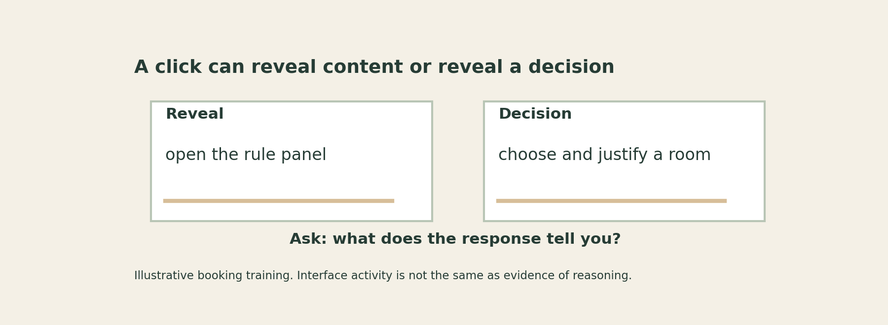
Redesign one interaction around a real decision
Present a request for sixteen people. The hall is already reserved. Offer plausible next actions: put the group in the small room, override the hall reservation or refer the conflict to the coordinator. Ask learners to choose and identify the decisive information.
Under the fictional rules, referral is the appropriate next action. The group exceeds the small-room capacity, and the existing reservation cannot simply be overridden. The explanation matters because a learner might select referral for an unrelated reason.
Now change one condition. A later request is for ten people, the small room is available and no additional constraint applies. Ask for the room choice and rationale. The second case checks whether learners can distinguish the situation rather than repeatedly choosing the most cautious-sounding option.
This is a design example, not a tested course. Real rules would need confirmation by the responsible organisation, and practice would need to preserve operational safeguards.
Interaction: Open a tab
What it can reveal: The content was accessed
What it cannot establish alone: The rule was understood
Interaction: Match a term to a definition
What it can reveal: Recognition of a relationship
What it cannot establish alone: Use in an unfamiliar case
Interaction: Choose a room
What it can reveal: A selected action
What it cannot establish alone: The reason for the choice
Interaction: Choose and explain a constraint
What it can reveal: Visible decision reasoning
What it cannot establish alone: Reliable performance under all conditions
Interaction: Respond to a changed case
What it can reveal: Use of the distinction in another example
What it cannot establish alone: Workplace transfer without further evidence
The table is an original audit tool. It is not a hierarchy in which every course must use the most elaborate interaction. Choose the least complicated format that reveals the target thinking adequately.
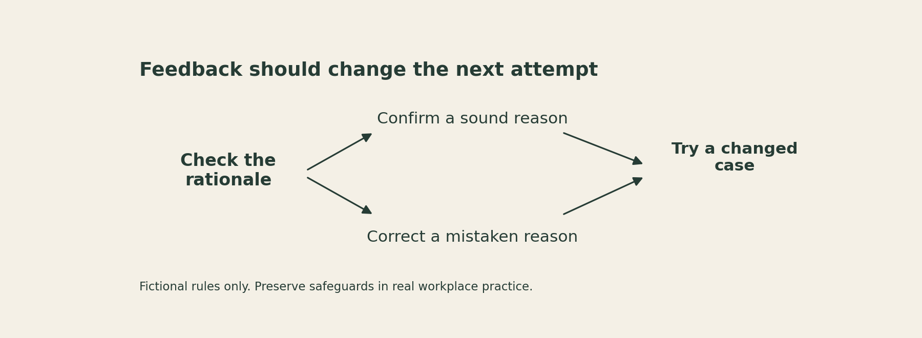
Write feedback that explains the distinction
“Incorrect. Try again” leaves the learner to guess what mattered. “Correct” confirms an answer but may leave a mistaken rationale untouched. Useful feedback identifies the relevant clue and connects it to the rule.
For the sixteen-person case, feedback could say: “The small room's capacity is twelve, so it cannot accommodate this request. The hall has a conflicting reservation. Under this scenario's rules, refer the conflict rather than replacing an existing booking.”
If learners selected the correct action for the wrong reason, address the reason. A response that says “always ask the coordinator” needs a different correction from one that recognises this particular conflict.
Then provide a changed case. Without another opportunity to use the distinction, feedback can become a paragraph learners read on the way to the next button. The new attempt should require the corrected reasoning, not merely repeat the same option positions.
Keep feedback concise enough to use. A long policy extract may be accurate but fail to highlight the specific relationship the learner missed. Link to or provide the full approved reference where appropriate, while making the immediate explanation clear.
Remove interaction that competes with the goal
A timed drag task may add motor and speed demands that are irrelevant to booking judgment. A hotspot that is difficult to locate may turn the task into a visual search problem. An inaccessible control may prevent a learner from demonstrating what they know.
Check keyboard access, instructions, reading order and alternative response needs as part of the design. Follow the organisation's accessibility requirements and individual accommodations. The learning goal should not be hidden behind a control that some learners cannot operate.
A static scenario with accessible answer choices and a short explanation field may be entirely adequate. Complexity should earn its place by serving the learning, not by making the course look more expensive.
Audit one screen before rebuilding the course
Choose one interaction and ask four questions: what decision does it require, what information determines that decision, what will the response reveal and what will feedback help the learner do next?
If the only answer is “the learner clicks to continue,” decide whether the screen is simply navigation. That can be fine. Do not count it as practice of a skill it never asks the learner to use.
Then inspect one later application opportunity. A course can contain a strong scenario yet still lack a route from practice to real work. A supported follow-up task or a usable reference may be needed.
Interactivity is a means of arranging learning, not a quality label. The useful interaction makes a consequential distinction visible and gives the learner a better next attempt.
Sources
CDC, Quality Training Standards for Public Health. Updated October 1, 2026; engagement, assessment and feedback guidance.
